
OVERVIEW
OVERVIEW
What is KOWIN?
The Korean International Women’s Network (KOWIN) consists of over ten chapters across the US. They aim to create a strong network of and encourage collaboration between Korean women around the world. The formation of KOWIN was facilitated by the Ministry of Gender Equality and Family of the Republic of Korea.
Challenge
KOWIN’s Pacific LA chapter came to me with the task of redesigning their website, the chapter’s main source of traffic and engagement from prospective members. Their previous website had a fairly intuitive structure, and there was a solid amount of material to work with, but the site lacked visual appeal and contained several error pages, outdated information, and inconsistencies in formatting and content. Additionally, the site was almost entirely in Korean, potentially limiting the organization’s demographic of viewers.
Goals
Make the layout more visually appealing and interesting for viewers
Drive increase in membership in the organization
Improve accessibility by writing English translations as well as adding alt text to all images
Screenshots from Original Site:
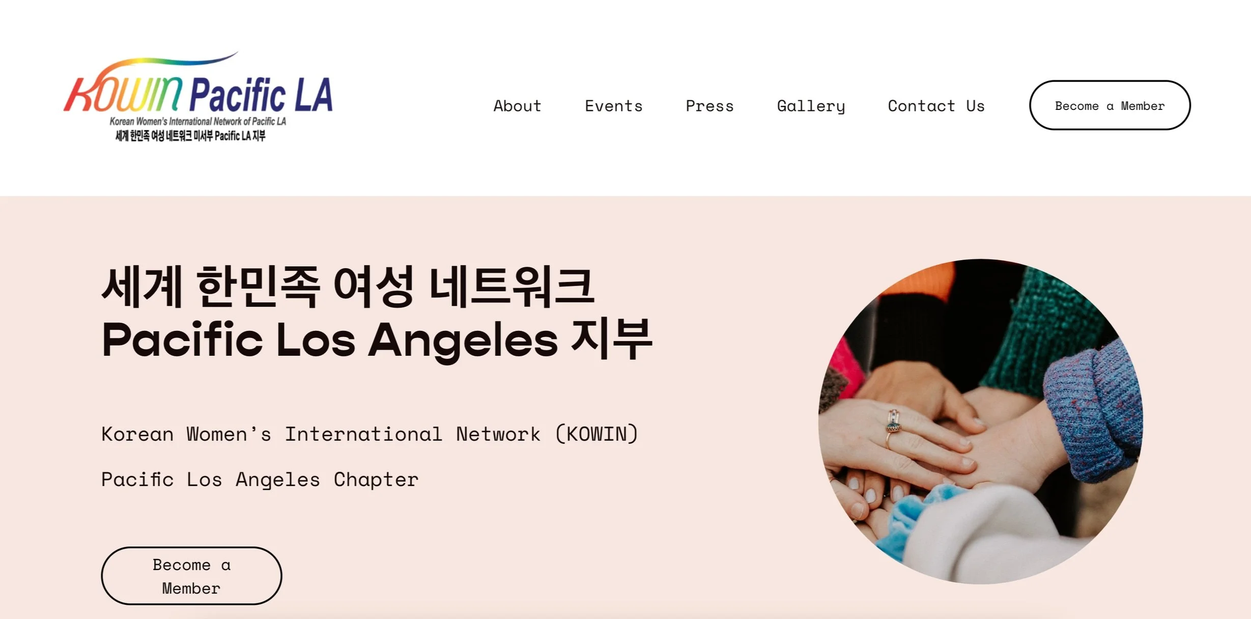
Home Page

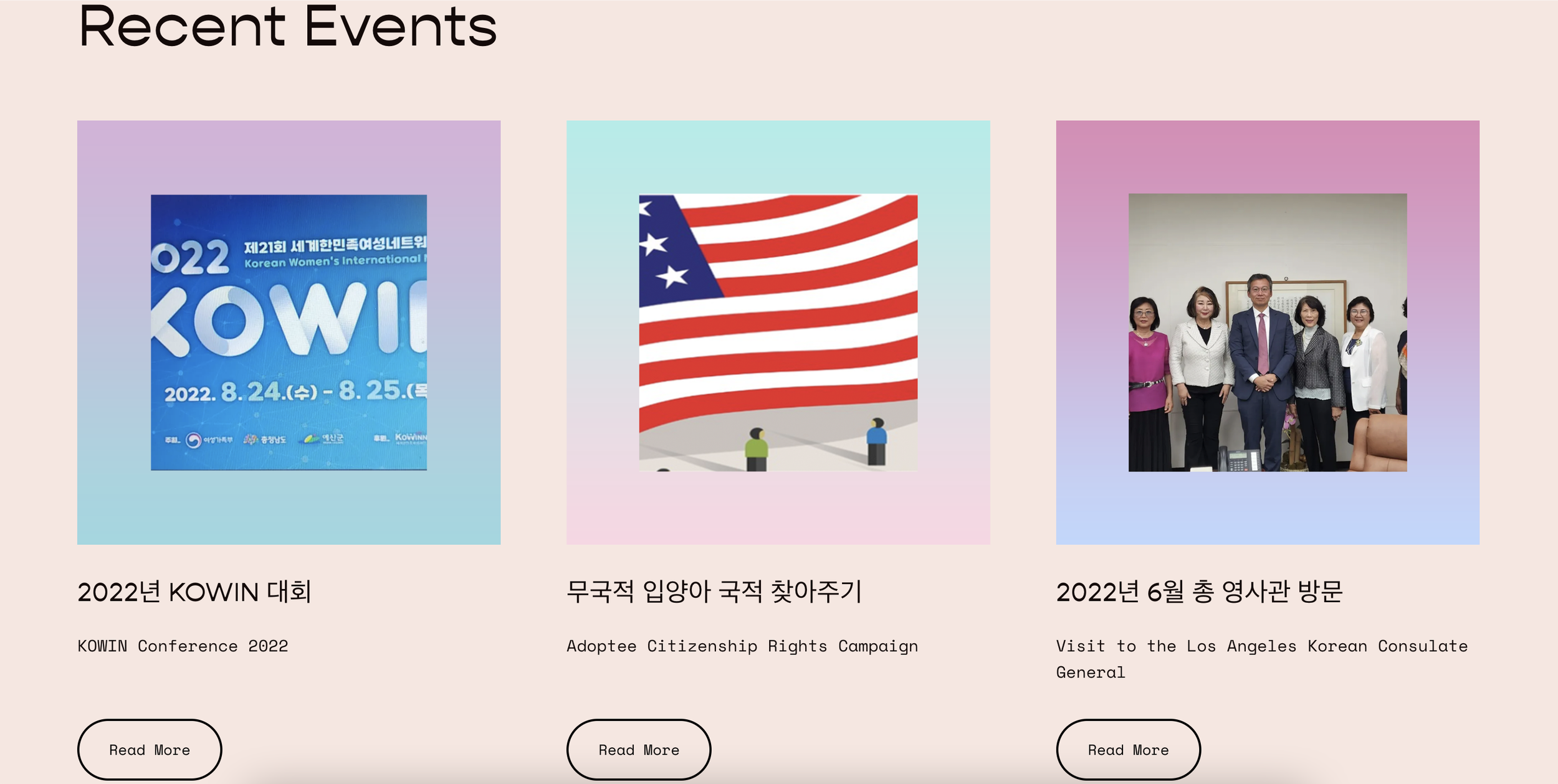
While this project was fairly simple due to the images and information being readily available on the previous site, one of the main elements I wanted to revamp was the home page. The previous home page consisted of just one graphic and a link to the membership application. While this simplicity reflects one of the organization’s main goals of increasing membership, I wanted to include preliminary information about the organization and some of their recent events for immediate and easy access for prospective members or just people who are curious about the organization. However, to preserve the organization’s goal of increasing membership, I included a button linking to the application in the Main Navigation menu as well as on the home page. While I considered including more sections in the home page, I decided to keep the content minimal so as to not overwhelm the user with information.
Regarding style guide, I stuck to a simple, timeless color theme throughout the site that reflects the organization’s celebration of femininity. I kept the colors light and the fonts simple to increase readability.

Additional Pages

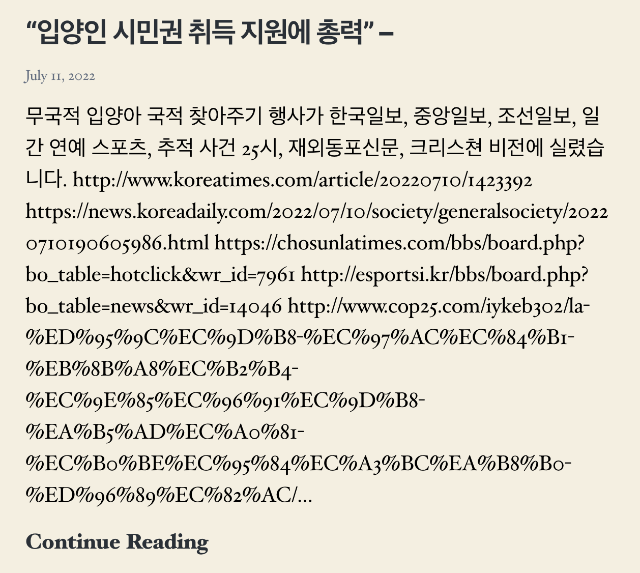
Two other pages I would like to highlight are the Events and Press pages. Because both of these pages contain so much written information, it was important for me to provide English translations in addition to the original Korean text in order to improve accessibility.
In the original Events page, there were inconsistencies in the event descriptions (i.e., some events had descriptions whereas others did not), so I contacted KOWIN members to provide descriptions for each event, and I then wrote English translations for each of them.
The purpose of the Press page is to compile all of the articles published about KOWIN for viewers to read more about the work that they do. To reflect this purpose, I formatted the articles in columns to mimic the format of a newspaper, adding a subtle but intentional touch to the interface.